San Francisco Chronicle App
Role: Interaction and UI Designer
Background
Hearst has a newspaper division that is responsible for over 30 local newspapers - their biggest are the San Francisco Chronicle and the Houston Chronicle. Their apps first launched in 2011 to complement their presence in print but with multimedia and breaking news features.
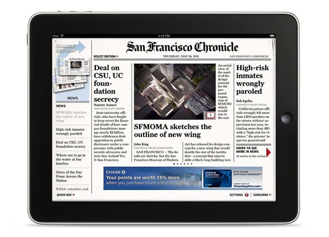
Since the launch, the app has suffered from extremely low conversion rates. There were a lot of neglected functional bugs within the app, for example, it would either often crash or have slow load times that left the readers frustrated. The similar look and feel of a printed newspaper also created difficulty in putting a lot of content, which did not justify their subscription price. Lastly, the dated designs also did not match The Chronicle’s rebrand and looked like a different newspaper.
The Goals
As the Lead IxD and UI designer at Hearst Newspapers, I was responsible for coming up with a new and modernized reading experience for our tablet readers. There was also a business goal of keeping our products consistent to have a fast-turnaround from the design and dev teams. With that in mind, I came up with a template and style guide for 4 of Hearst’s largest local newspaper apps: San Francisco Chronicle, Houston Chronicle, Times Union, and San Antonio Express.
The Research
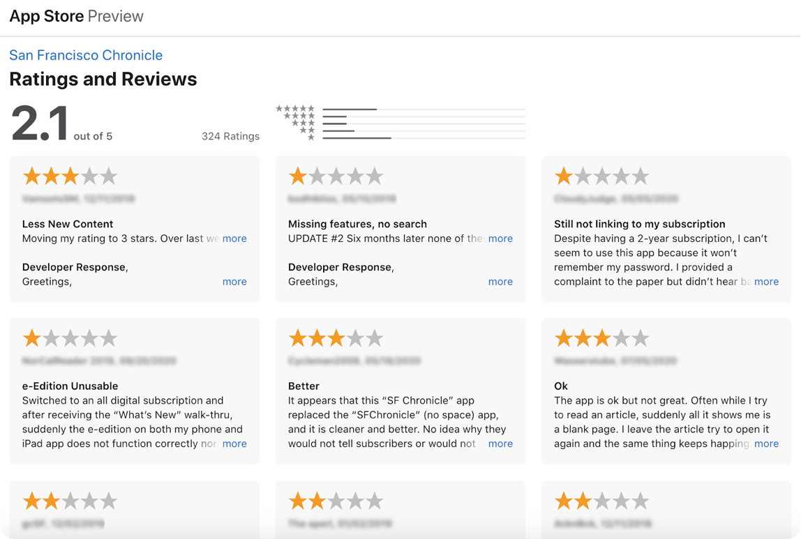
To understand the problems, the Researcher, Product Manager, and I went through several hundreds of app reviews and interviewed our customer support team to gain context of top user complaints. We reviewed their list of common complaints and discovered that the app just did not function well, or at all. The app load was slow, it froze, or it crashed often.
To understand typical Hearst news iPad reader flow, we sent out a comprehensive survey to over 3k iPad readers in four markets and we got back around 300 responses. We uncovered that even though the majority of the iPad readers viewed the app as a replacement for printed newspapers, they were unenthusiastic of the app looking like a real newspaper.
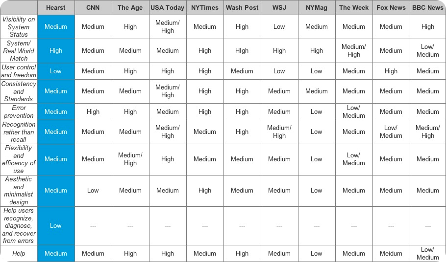
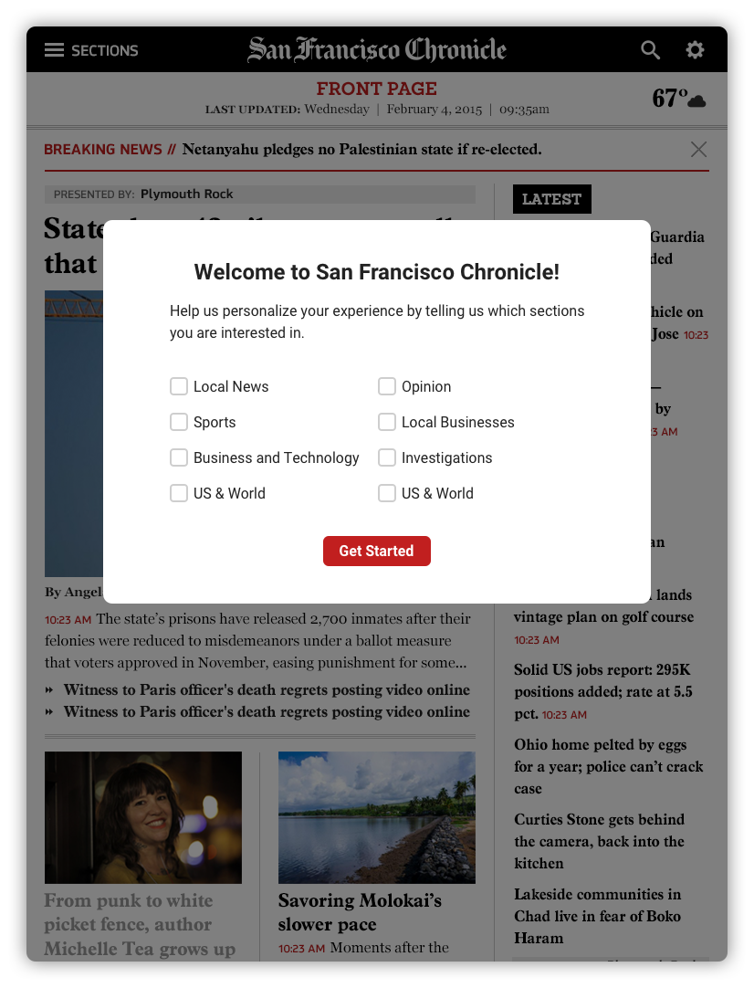
While UXR aggregated all the data from the survey, I did a competitive analysis and heuristic evaluation of other news apps that helped turn our data into tangible designs. Here I learned that most news apps allowed the readers to have user control and freedom in personalizing their experience. This was a product requirement and user story that we originally did not have, but later on, was added as a must-have from our learnings through the user survey we sent.
Designs and Iterations
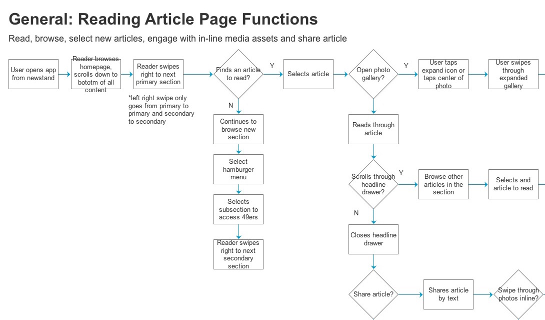
Armed with all this information about our customer and business problems, The UX Architect and I collaborated to design a flowchart and low-fidelity prototype to test out our flow. As he tested this out with 5 current users and 5 unfamiliar users, I was busy working with the Creative Director on the branding.
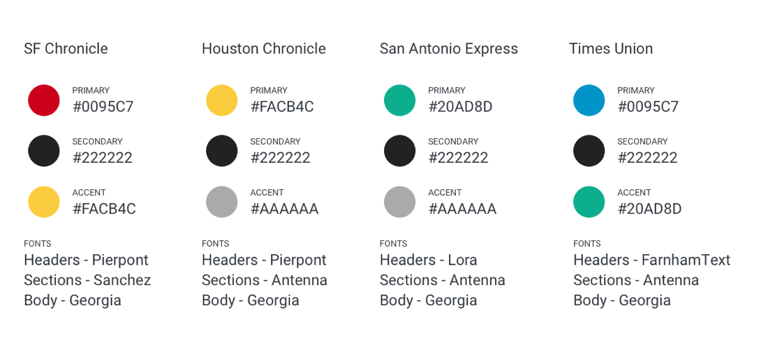
When the design team did a rebrand of their 4 major local newspapers, they used fonts that did not have a license for the apps. So I looked for cheaper options to use for the apps but that still looks on brand. Next was choosing the primary, secondary, and accent colors. This was easier as I just followed what they already picked when they did the rebrand.
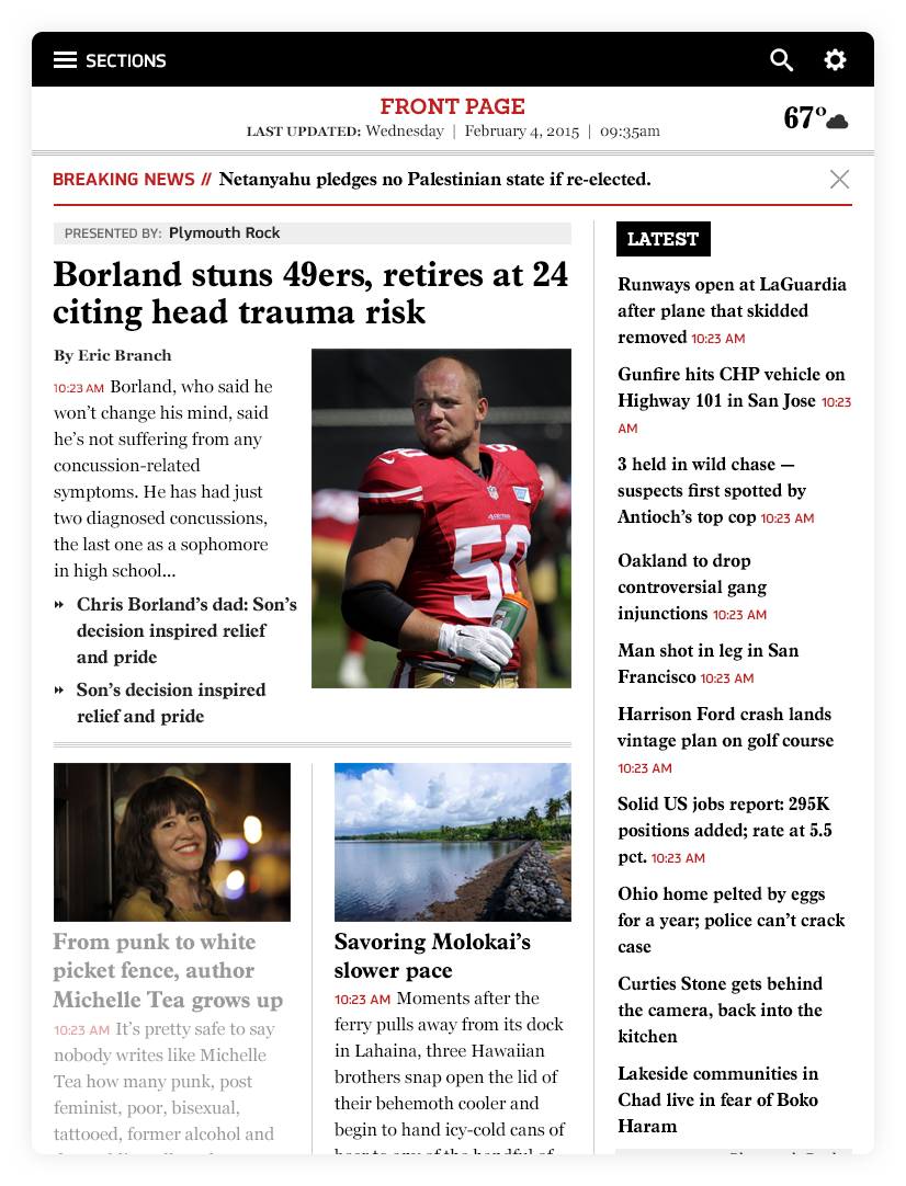
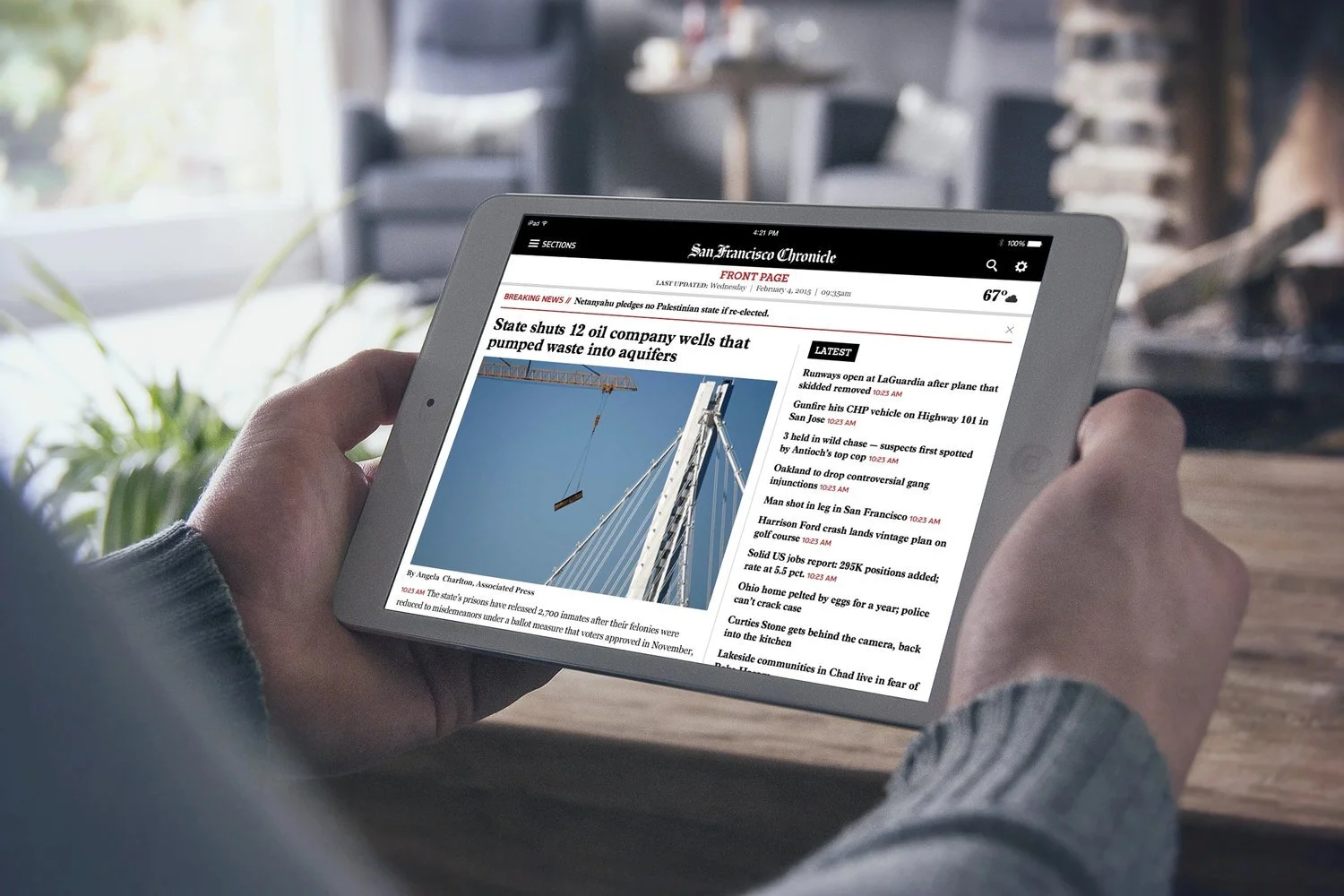
Based on user research, we learned that majority of our iPad readers viewed the app as a replacement for print, but they were unenthusiastic of it looking like a real newspaper which our previous app looked like. So I came up with this layout where we show articles that were on the paper for that day on the left column, while we show the latest news in the right column.
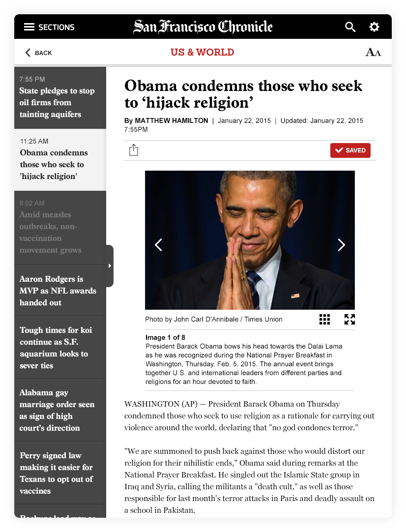
We also learned that once readers are on an article, they’d prefer to see more headlines in the same view so I came up with this secondary navigation that opens, and scrolls vertically with articles within the same category.
We tested a different layout where the secondary navigation goes horizontally above the article title. Between the 2 versions, the vertical option performed better.
For Revenue
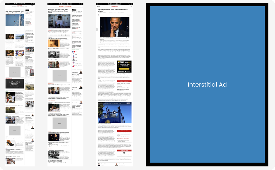
For us to get more revenue, we collaborated with our Ad Ops team to discuss different solutions on how to include banners onto our app without disrupting our readers’ experience. We put 3-4 medium rectangle ads on the homepage, section pages, and article pages. With a larger visual impact than traditional banners, the medium rectangle ads offer high viewability at a low cost for us. We also added interstitial display ads after a user swipes 3x left or right when switching to different sections of the newspaper. Interstitial display ads appear full-screen during a content break within the app. Since these ads fill the screen, they easily grab the audience’s attention and are one of the most engaging in-app display ads.
Navigation
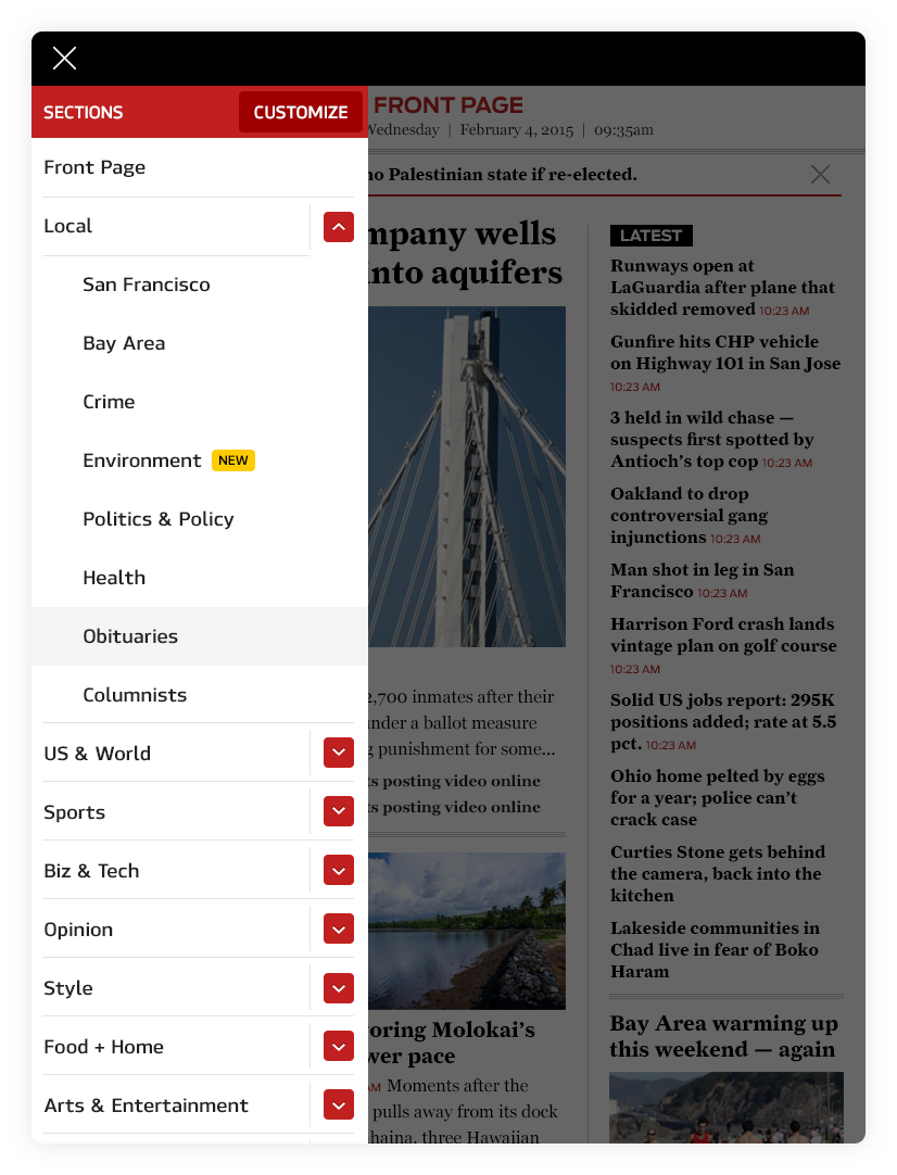
Our readers also requested that they can customize their app — from what categories they are interested in, to which categories they want to see first. I designed the sections menu to include a “customize” button that allows users to select which categories they want to include, as well as a reordering mechanism on which categories they prefer reading first.
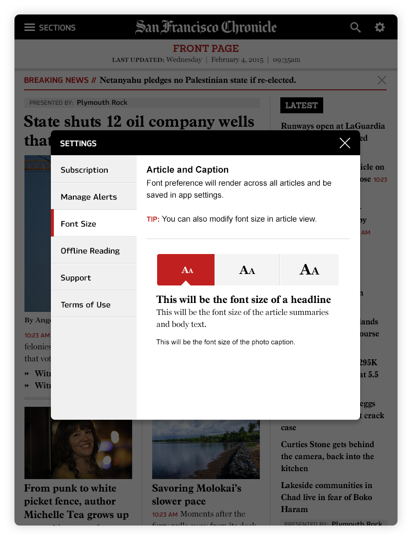
Per our user survey, we found out that the majority of our readers were in the above 40’s age range, half are retired and the other half are working professionals. They required a text resizer function. By default, the smallest option is selected. This was 6 years ago, so I was still not educated in accessibility. But looking back now, I probably would have added more options in their reading settings like being able to choose the font style, line spacing, and dark vs light mode.
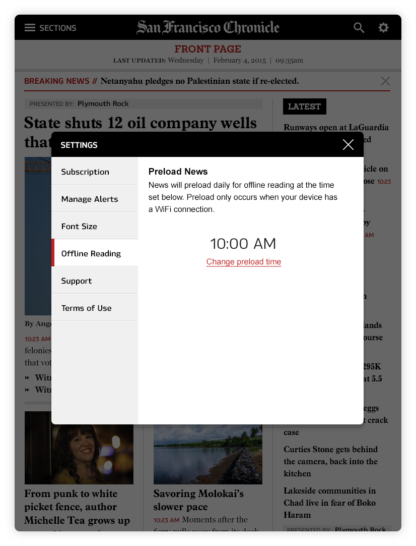
Another insight we learned in the survey was that the other half of our users are busy working professionals who telecommute. They require a backup option for reading their news when they are in offline mode which would store the content locally. This is something that they can set a time for in advance and content will preload automatically.
We know our general audience, but we really don’t know anything else about our users when they sign up. So we set up the simplest onboarding experience for our first phase to get to know them better. Asking for their preference in which sections they like reading will automatically reorganize their experience.
As a team, we came up with a plan, recruited users, and wrote interview questions to validate our design decisions and weed out any unnecessary elements. We opted for moderated usability tests in the 3 cities (Albany, Houston, and San Antonio). The UXR and PM were there in-person while I stayed in NY but I called in to listen in on all the interviews.
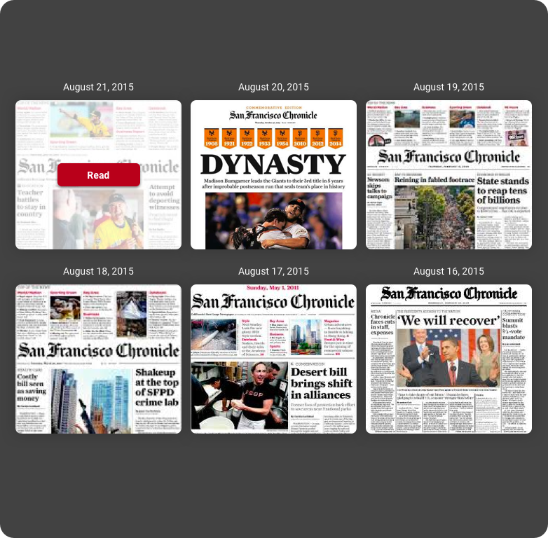
The old app gave them access to the digital format of the newspaper from the past 7 days. And per our previous survey, the readers gave that feature a really high rating. So it was surprising to learn during this testing that readers were not as interested in this feature in our redesign. We decided to scrap this idea for launch and keep an eye out if users start requesting this feature again.
The Impact
The new app was released in the fall of 2015. Since the launch, the team has been actively iterating to address user feedback.
“The redesign is user-friendly and intuitive. I really like having this headline list for browsing!”
“The redesign is clean and easy to navigate. It wouldn’t take me long to find out where something was if I missed it.”
“Customizing which sections I want… that’s huge!”