BrainPOP Store
Role: Lead Product Designer
Team: UX Researcher, Data Analyst, Project Manager, Product Manager,
4 Developers, 2 QA Engineers, Marketing Copywriter
Overview
BrainPOP is an educational site that provides content specifically for Kindergarten through 8th grade. They first launched in 1999 and since then, their customer base has grown by over 30% of U.S. schools. In order to supply demand, they aim to redesign the store into a more robust e-commerce platform to help the business scale, let smaller customers self-serve, and free up Sales Operations to focus on conversations with larger customers.
The Problems
• BrainPOP grew to sell to millions of customers, but most customers bought subscriptions by talking directly to a salesperson. The online store was mostly neglected over 20 years of business and store conversion rates were very low.
• Our back-end also could not support selling new add-on products which caused a lot of lost sales.
• The prices and packages were also very confusing to customers who did not understand what they were buying. Customers were calling our support team asking for refunds because they thought they were buying something else.
•The store’s dated Flash design also did not match BrainPOP’s rebrand, and users were getting confused if they were in the right place.
The Tasks
Our squad is tasked to:
Let smaller customers self-serve by using the store to understand subscription types and therefore purchase one
Free up Sales Operations to focus on conversations with larger customers
Redesign BrainPOP’s online storefront to help the business scale
Match new branding
Comply with WCAG 2.0 AA
The Research
I started by investigating needs and pain points in the customer journey when buying one of our subscriptions. The Product Manager and I conducted 6 internal interviews with colleagues from different departments that customers interacted with. Then, I analyzed and organized the information to draw maps of the experience.
Our customers have 2 options, they can pay immediately or reserve a subscription to pay later through a purchase order. Both options created delays and confusion downstream.
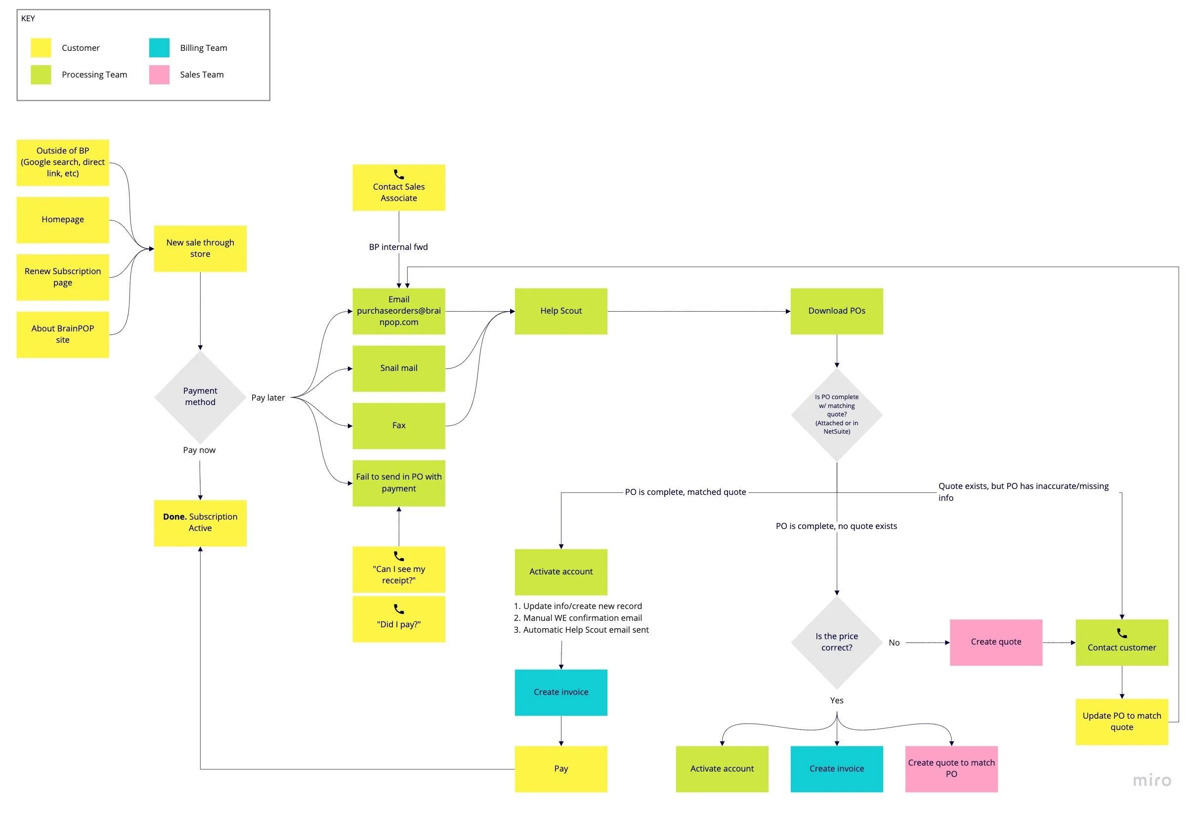
Purchasing flow when buying a subscription for BrainPOP
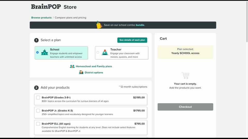
When customers fill out the purchase order form, sometimes they would either fail to fax the form in, or they would leave out crucial information such as their credit card. Our data entry and accounting teams would have time-consuming back and forth with the customer, adding to delays of up to two weeks before the customer could even use our product. We knew this is an internal process issue and something that we are still fixing, but what I was able to help with was to redesign the order form so it has more information on the different plans and products they are able to purchase. I used higher contrast on the labels so that users can easily read the content, and I used a grid for a well-aligned layout to help users easily scan the form.
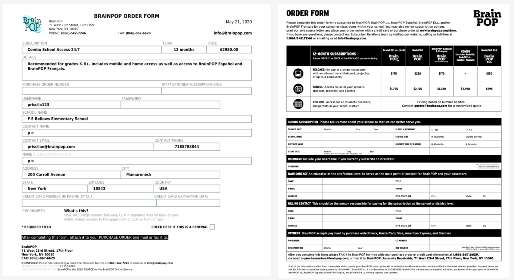
Old order form (left) vs New order form (right)
And then there were customers who purchased through the store and did not receive receipts in their confirmation emails. This resulted in more delays as our team got tied up in phone calls asking them to manually hunt down receipts in our database. I worked with our copywriter to redesign and reword several different emails that varied depending on the customer’s subscription type and payment type. With the general principle of keeping the information clear and transparent, I wanted to make sure that customers had a clear confirmation of their subscription status, and had a clear CTA to fill out and pay for their purchase order.
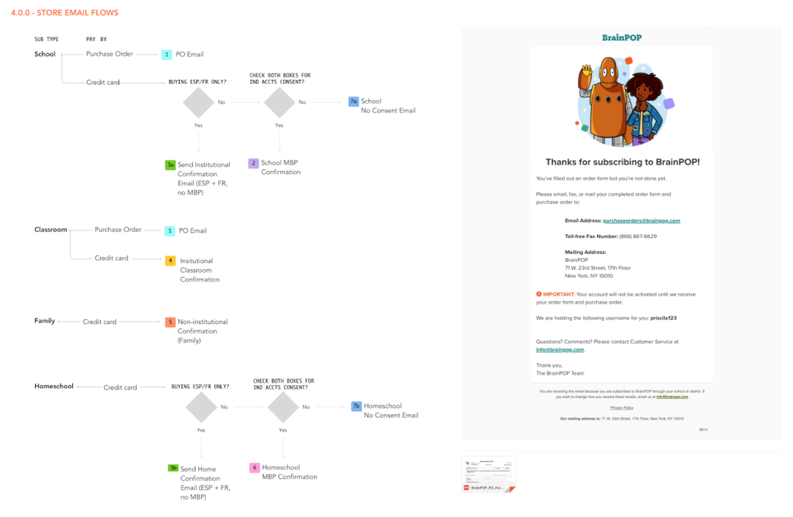
Email flows and sample email
Issues with Current Store Flow
Next, I focused on the online store experience. To understand the customer flows, I ran through each flow manually and checked for usability. I consulted with our Data Analyst on how customer information was stored. I also investigated our Google Analytics data to see how users moved through the store. I found three main issues to tackle.
Subscription options are difficult to compare
The Google Analytics data showed that the majority of customers navigate in and out of subscription options, instead of moving forward in the purchase flow.Forms are frustrating to fill out
The purchase flow broke many usability conventions. For example, the system status was perpetually unclear. A “username taken” error only appeared after filling out a long form.The checkout flow causes data hygiene issues
Customers were forced to type out their school information, despite the data already existing in our database. The duplicate school data made it messy for the Data team to analyze renewal, and for Support to identify customers.
Designs and Iterations
With the information I’ve gathered about our customer and business problems, I designed a low-fidelity prototype to quickly test out potential solutions. I worked with our Researcher to come up with a test plan. We opted for a moderated interview to both ask behavioral questions about purchasing and observe customers using the prototype. Together we also wrote an interview script based on our main research questions which were “What key features sway a customer to purchase BP instead of another education software”, and “Can a customer understand the different options to purchase”.
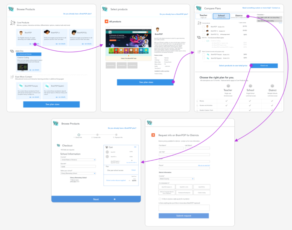
Select pages for user flow
Audience and Personas
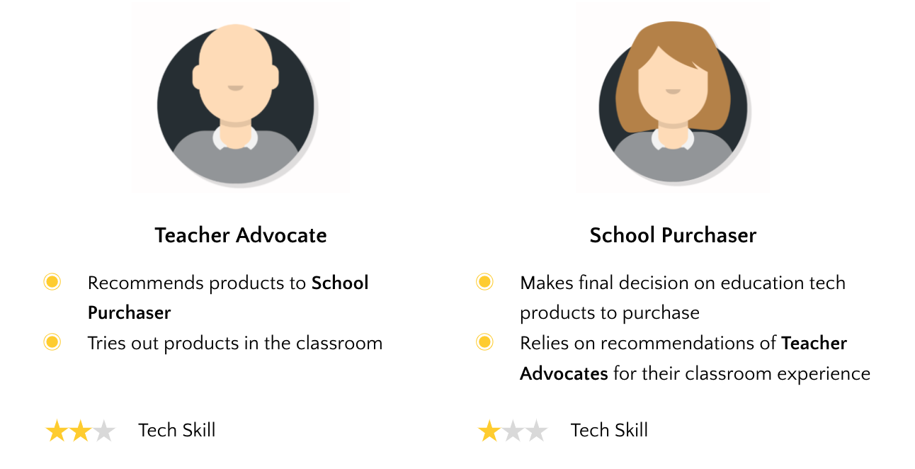
At first, our product requirements and user stories were only about the School Purchaser, whom we knew from prior research is often a district-level or school-level administrator who makes the final call to buy BrainPOP. Through these interviews, however, I discovered a second key role, the Teacher Advocate. Four out of seven customers interviewed were Teacher Advocates - classroom teachers whom School Purchasers trusted to assess and vet products.
The main concerns of a teacher advocate are about students being excited about the product, or the product’s alignment to standards. School purchasers, on the other hand, think about the cost per student, and the number of teachers using the product successfully in the classroom.
One key insight was that School Purchasers and Teacher advocates work together in low-tech ways to purchase ed-tech products. Multiple Teacher Advocates mentioned that their school purchaser was uncomfortable with technology, and preferred reading printouts to websites. More than one interviewee specifically said that if they wanted their school purchaser to buy BP, they would print out our “Compare plans” page, and physically place it on their School Purchaser’s desk or mailbox.
To support these users, I designed and wrote marketing copy for a printable PDF to download and share. I iterated on the PDF with feedback from stakeholders in Marketing and Sales to refine copywriting and content.
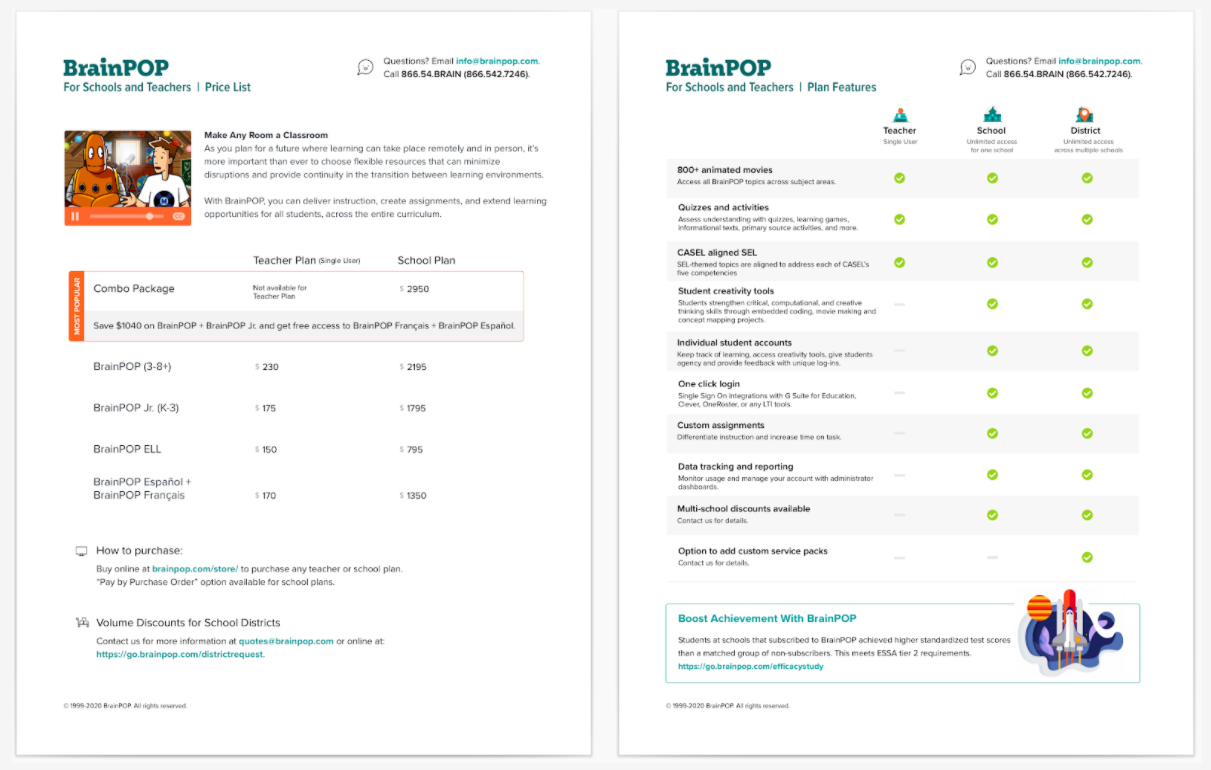
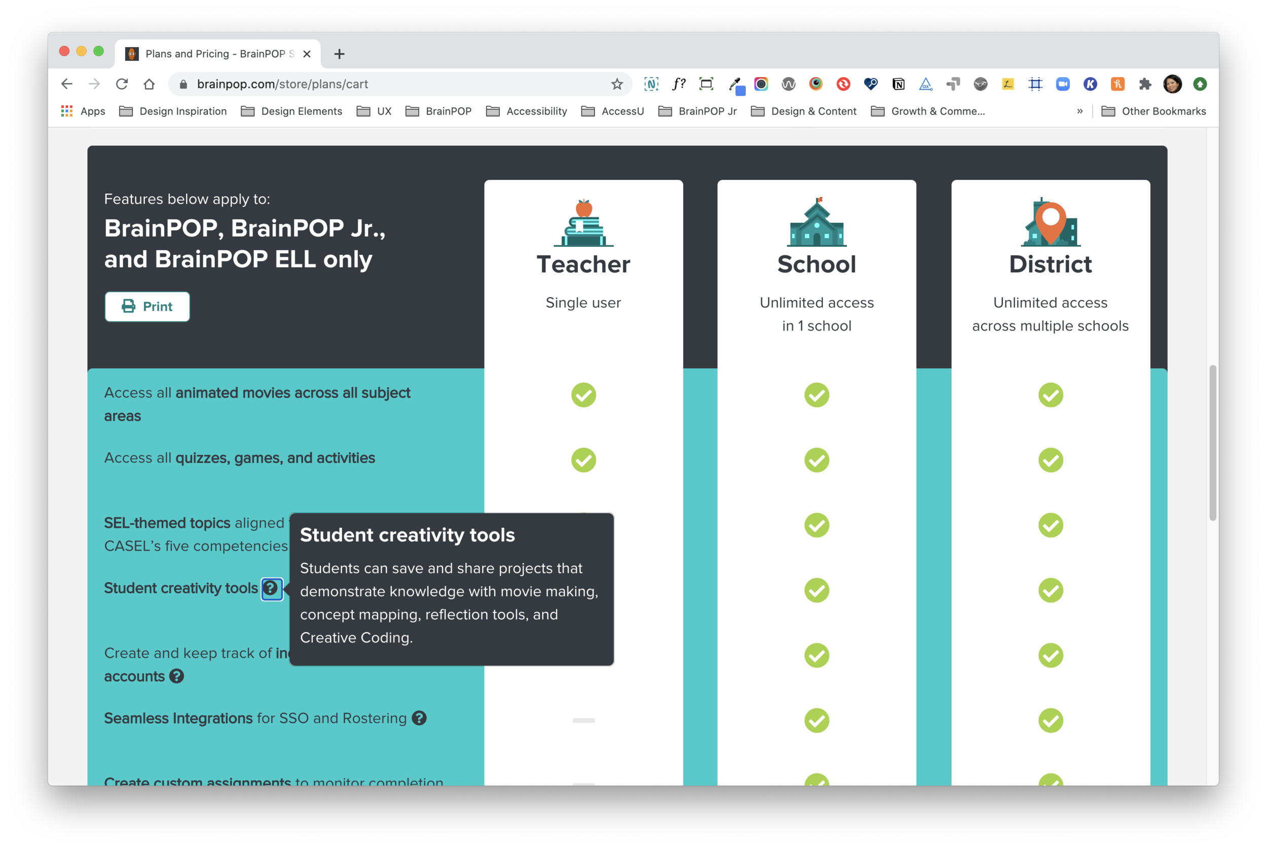
Two-pager Plans and Pricing PDF
We also discovered that the key values School Purchasers looked for were cost per student or teacher, and ease of implementation, and data tracking. To make the “cost per teacher” clearer to our users, I asked Marketing to iterate on the copy. We reframed the School Plan as “best value for 5+ teachers.” For ease of implementation, school admins often rely on Single Sign-On tools like Google or Clever to automatically create student and teacher accounts. Since our most expensive School plan has the option that supported SSO, I emphasized this feature by using the same language admins used in interviews. I also made this feature, as well as data tracking, more prominent in the plan comparison.
The Impact
Since the new site launched in June 2019:
Online sales have increased 54%
Customer support calls have decreased 31%
Average of 21 working hours saved for the Sales team
Marketing has run 8 promotional testings with the new CMS
Next Steps
BrainPOP’s store finally became a trustworthy place for schools to make an investment in their children. We saw online school sales jump to 54%, and upgraded our business operations. Since the launch, we’ve added more functions an e-commerce site should have like being able to use coupons, promotions, renewals, and cancellations. We also built a CMS that allows Marketing and other teams to edit the site, eliminating the need for developer hours to make simple content updates. With this addition, we are now able to experiment and do more A/B testings.